Texting While Walking

February 20, 2012

Now that so many city pedestrians are transfixed by their smartphones, retailers will have to get savvier about attracting attention. Signs will have to become snappier and more eye-catching than ever, to accommodate glances upwards that might last only milliseconds.

Will we see more ground-level signboards? Flashy displays on the sidewalk? Audible calls to action? The look of commercial streets is bound to change.

The downward gazes mean that it’s getting more difficult to navigate city spaces. The filmmaker Casey Neistat addresses this problem in the hilarious Texting While Walking:

I first came across the clever film on the New York Times site. It’s part of their Op-Docs series and the page featuring the film includes a statement by Neistat. What do you think of the solution demonstrated in the film? Do you have any suggestions for texting etiquette while out in public?

I ♥ you…

February 14, 2012

I heart you

If someone wrote this to you, how would you take the words in parentheses? The handwriting here looks playful, lighthearted. The crosses on the t‘s look like smiles. Let’s hope that a little bit was just a prelude to a lot.

I took this photo quite some time ago. I was in the neighbourhood a few days ago and noticed the wall is painted completely white. So this photo is now a time capsule.

Speaking of love, the most viewed post on Toronto Type is True Love Café. Have you ever been?

Happy Valentine’s Day everyone!

bannock

February 7, 2012

bannock

This sign appeals to me for two reasons. One is the contrast between sleek letters and rough wood. It’s a striking juxtaposition that makes me curious about the world inside this restaurant.

The other reason is a detail, the unusual shape inside the “o”. You could read it as a cross section of a piece of macaroni. Or a piece of bread presented on a large white plate. What do you see?

It’s amazing how effective a variation can be in making a sign memorable.

West

January 31, 2012

West

This word is part of a large mural that says “West Queen West”. This is the first “West” in the design and it’s delightful.

I always enjoy it when letters and buildings find moments of happy coexistence and this is a good example. These letters look like they’re leaping over the top of the window. The “E” seems to be having the most fun of the bunch.

Wheel Alignment Centre

January 22, 2012

Wheel Alignment Centre

I have a strong affection for hand-painted signs, probably because they’re a relief to the eye after so much time looking at digital type. Their small irregularities make them uniquely expressive, like human faces.

Here’s a sign on an auto body shop with letters carefully dispersed across garage door window panes. There’s something off though—check out the final syllable of “Alignment”. Suddenly the painting style becomes a little more, well, relaxed.

It reminds me of ambitious New Year’s resolutions made on January first that go somewhat awry by the end of the month.

What do you think the story is behind this misaligned “Alignment”?

The Joy of Books

January 14, 2012

One of my favourite bookstores in the city is Type Books, just south of Trinity Bellwoods Park. It gives me pleasure that when I enter “toronto type” in Google, this blog and Type Books are next to each other in the search results. The bookstore may not be in my part of town, but in Google we’re neighbours.

So, you can just imagine what I kick I got to discover the following video, thanks to one of my brothers who sent me a link:

The video was created by Sean Ohlenkamp, his wife Lisa Blonder Ohlenkamp and a whole bunch of volunteers, with music by Grayson Matthews. Hats off to all of them for a lovely piece of work. (Full production credits are on YouTube.)

If and when you visit this location of Type Books (at 883 Queen Street West), keep your eyes open for interesting signs in the vicinity. It’s the neighbourhood where I’ve photographed a number of the signs featured on this blog (although I won’t tell you which ones!) and there are many others worth checking out.

Ten to one…

January 5, 2012

Ten to one

Were you counting down to midnight as 2011 ended and 2012 began? And now that we’re a few days into the new year, are you thinking about how you’d like to live your life in the days and months ahead?

This clock on the side of a Toronto pub is permanently halted at a moment of enjoyment—Guinness Time. Do you think when we are most fully alive in the present, we are transcending the relentless ticking of clocks? At least temporarily?

I don’t have a definitive answer, but I can offer this: whatever transports you and enlivens you and makes you an all-round better human being, may you enjoy those things wholeheartedly in the year to come. Happy New Year!

Two tur-lte doves…

December 21, 2011

Two tur-lte doves...

Here’s a glimpse of Holt Renfrew’s current Christmas windows. As part of the extravaganza, you’ll find music and lyrics for The Twelve Days of Christmas.

There’s just one little problem. Somewhere along the way, a designer with a flair for creative spelling was involved. Or a lack of vigilance for typos.

Then again, perhaps it was intentional, an example of how you might sing the song when you’ve had one too many egg nogs.

Merry Christmas everyone!

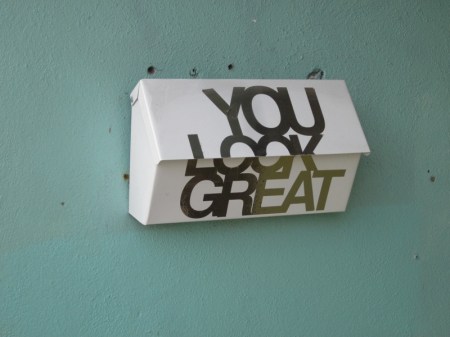
You Look Great

December 12, 2011

You Look Great

Here’s a mailbox with a gift for flattery. I wonder if the person who lives here has a crush on the mailman. It’s certainly a more enjoyable message than “No Flyers Please.”

The letters have a metallic sheen, which is not quite evident in this photo. Even though they don’t offer a detailed reflection, they call to mind the act of looking in the mirror.

Maybe there’s something narcissistic going on here and the resident customized the mailbox to guarantee getting a daily compliment.

with love from Canada

November 30, 2011

with love from Canada

This is a close up shot of a window display at a jewellery and gift shop called Labour of Love. I was captivated by the cascade of envelopes and packages, a blizzard arrested in mid-flight.

Why are hand-addressed envelopes and packages so compelling? Is it now largely due to their increasing rarity in a digital age? It’s interesting that icons of envelopes are inescapable online, even as paper envelopes become relics.

This display is a smart marketing move. Not only is it attention-grabbing, it puts you in the right mood for giving thoughtful gifts. The shop also carries a lot of unusual greeting cards.

It’s the season to escape the keyboard occasionally and pick up a pen!