Archive for the ‘My Favourites’ Category

The Management…

March 31, 2014

My father took this picture at a car wash entry. It’s not the first time I’ve featured a photo by him. (Thanks Dad!)

The sign, with its all caps and red and white colour scheme, is reminiscent of a stop sign and has the same blunt force.

What do you think? Would you patronize a business with a sign like this one?

Advertisement

Parking

February 28, 2014

Parking

Parking signs are at once simple and multifarious. They usually consist of a capital P and an arrow, and within that template there are endless possibilities.

Here’s a Parking sign with a unique difference. There’s no arrow, but instead we’re presented with a gesturing cartoon character. Imagine if all Toronto’s signs were this exuberant.

I’m curious about the exclamation in the lower right. Does it say Parking in Japanese? Readers, if one of you can read this, please let us know in the comments.

Ezra’s Pound

July 31, 2013

Ezra's Pound

To make a chalkboard sign is to embrace impermanence. No matter how stylish or ornate the lettering is, it’s designed to be eventually erased.

What’s more, an outdoor chalkboard sign is vulnerable to bad weather. One sudden rainstorm and it’s wiped out.

This chalkboard sign for Ezra’s Pound in Liberty Village is super-enthusiastic, regardless of its temporary nature. It incorporates not one but three arrows and the word “Back” is full of flair.

This sign really, really, really wants to get you excited about iced espresso and I admire its conviction.

Glyphs

April 12, 2012

Glyphs

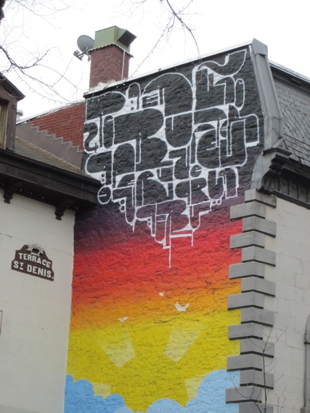
This is the upper part of a mural I spotted on Rue St. Denis while in Montreal recently. A cloud of glyphs pulsates with life.

There’s a playful Pac-Man-like quality to the forms and not all of them seem to be letters. Some are more like strange creatures.

The design teases us with the possibility of meaning, but I doubt it’s intended to make much sense. Can you discover a message here?

Records

October 16, 2011

Records

These letters look like they were kidnapped in Las Vegas and smuggled to Toronto. They have a showbiz razzle-dazzle that is perfectly fitting for a store that sells music.

Ever since the demise of Sam the Record Man, Toronto hasn’t had a sign that captures the larger-than-life joys of hearing music you love. But this one has a bit of that magic to it.

I like the fact that it’s a one-word sign with no brand name attached. Only when you check out the window display do you learn that the store is actually called Sonic Boom.

A restaurant labeled “Food” or a coffee shop labelled simply Coffee” might seem odd. But at a time when vinyl is a more rarified pleasure, maybe “Records” is all you really need to say.

Toronto Hydro Electric System

May 31, 2011

Toronto Hydro Electric System

It’s easy to miss this sign on an overcast day: the letters blend into their stone backdrop. But on a sunny day the sign comes alive, the cast shadows elongating and tilting with the time of day. It’s an unexpected sundial.

I love the way the oxidation stains on the wall interact with the shapes of the shadows, creating an almost phosphorescent effect. And also the way you can ignore the metal letters completely and just read the temporary design they’ve made. Beautiful.

The Ballroom

March 3, 2011

The Ballroom

This sign is urgent and nonsensical at the same time. Its hyperactive energy puts a smile on my face.

There’s a whole string of these along a redone facade in the club district, and even though they’re obviously unfinished, I like them exactly the way they are. The wrinkled blue film adds to the sense of drama. When it’s peeled away, what will be revealed?

A large sign higher up announces the business name more clearly – The Ballroom – and if that mystifies you, a little detective work will tell you this is a new take on the bowling alley.

Scrambled, the letters of the name have a mischievous pull, as if they’re on their way to spelling other things. Like bowling pins knocked over and rearranged, they’re alive with possibility.

No Pie

January 17, 2011

No Pie

I spotted this sign on a TTC platform this weekend. A few strokes of a magic marker and a cigarette was transformed: “No Pie” became TTC by-law number one.

I wonder if the clever person who amended this was feeling oppressed by negative New Year’s resolutions? Doesn’t “No Pie” capture that January feeling perfectly?

I say we lift the ban: more pie for everyone! Let’s eat it boldly and defiantly! Let’s devour it on TTC platforms all over the city!

CPBU0645188

November 13, 2010

CPBU0645188

Sometimes not understanding is more pleasurable than understanding.

This string of letters and numbers is meaningless to a person walking by on the street; it’s the sort of visual noise we’re used to filtering out. But its lack of significance is exactly what makes it interesting to look at. It doesn’t offer any information we can act on, it just passively waits to be appreciated. Or not.

Tasty Chicken House

October 14, 2010

Tasty Chicken House

My brain insists on thinking of this as a Chicken House that’s tasty, even though I know that’s not what the sign really means. Looks like brick, glass, wood, formica… tastes like chicken!

Two things I love about this sign: the chicken illustration that looks like something fed through a photocopier multiple times, and also the letters that get wider at the top to respond to the curved layout. Check out the “H” and the “U”. Tasty indeed.