Archive for the ‘Revisions’ Category

Stanley’s OK & Grocery

February 28, 2015

Stanley's OK & Grocery

Longtime followers of this blog will know that I have a fascination with revised signs. Here’s one that caught my attention recently.

The blocked out letters are intriguing. The sign probably used to say “Stanley’s Smoke & Grocery.” I suspect that in order to abide by anti-smoking laws, the owner’s made an adjustment so as to avoid replacing the sign entirely.

I wonder if attentive smokers still expect to find their vice inside.

Advertisement

Shishkabob

August 8, 2012

Shishkabob

Looks like there’s been a price adjustment here. I love how the yellow type calls so much attention to itself.

Over on the window to the right it says shishkabobs are $2.25. The restaurant is temporarily closed right now. Maybe they’ll revise that sign when they reopen.

I find the peculiar price endearing for some reason. And check out the eight: with its bigger loop at the top, it seems to be upside down. It’s a little twist in an already idiosyncratic sign.

Enjoyed the post? Browse Numbers

Post No Bills

June 2, 2012

Post No Bills

A renegade sign maker decided to counter this Post No Bills notice with an enthusiastic call to action.

I appreciate the fact that the lettering is similar to the original. It’s like a disaffected high school student mimicking the voice of the principal, but with a message of liberation.

The word “ALL” gets the stress here, as if the sign maker expects a tidal wave of communication to be released.

When I last checked there were hardly any posters on the wall. For the time being, the prohibition is holding sway.

Update, June 23:

I neglected to mention that when I took the photo above, the head-to-head combat between Post No Bills and Post All The Bills was happening along an entire alleyway. The picture shows just one skirmish.

Recently there’s been a reaction, a barrage of posters depicting a dizzying array of Bills, many of them figures you’d recognize and also some you might not. A once spartan hoarding is now a giddy Name That Bill extravaganza.

Can you identify the Bills in the sampling below?

Post No Bills

Post All The Bills

Post All The Bills

Post No Bills

Post All The Bills

Enjoyed this post? Browse Stencils

6

May 24, 2012

6

I spotted this number on a gate post in front of a house. A brassy six is layered on top of a handmade predecessor.

I wonder why they didn’t paint the post before adding the new number. Maybe they didn’t want to be bothered.

Or who knows, maybe they discovered they liked the doubled up effect. Why settle for a solo number when you can create friction between two?

Then again, maybe it’s the home of a couple that argues a lot and it’s even reflected in the look of the front gate.

What do you think?

TTC BY-LAW NO. 1

May 2, 2012

TTC BY-LAW NO. 1

I appreciate smoke-free environments, but the sight of prohibitions everywhere gets me down. The signs are usually so stern and humourless that it’s no wonder people try to lighten the mood with a little whimsy.

Last year I featured a no smoking sign that someone had transformed into a ban on pie. Here’s one that someone has turned into an edict against trains.

Given that the TTC openly admits to the possibility of electrocuting you, I wonder what punishment they’ve cooked up for renegade smokers.

Or for that matter, for people who alter their signs.

Bond Saloon

April 26, 2012

Bond Saloon

One of the pleasures of looking at Toronto signs is that there are so many in more than one language to discover. Here’s one in English and Tamil for a hair salon.

Saloon, rather. The business name has a tough-guy ring that also conjures up Agent 007.

I imagine it’s the proprietor in the painting and I wonder if he painted the portrait himself.  On Flickr there’s a photo of the same sign taken a few years ago, and the shirt is a different colour. I guess the sign is repainted now and then.

Wouldn’t it be something if his hairstyle got updated every so often? Or if he gradually looked more mature with each repainting?

Adore Pedestrians

March 7, 2012

Adore Pedestrians

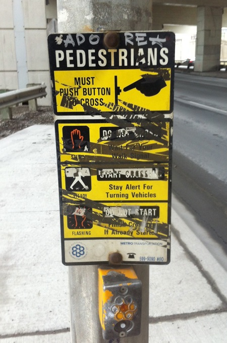
I love instructions for simple activities like crossing the street. They convey an image of the world as a helpful place. They say: no matter how small your concern, there’s guidance if you look for it.

The signs at Toronto crosswalks are often hard to read, unfortunately. They’re frequently encrusted with grime or barnacled with stickers or messed up in one way or another.

In this case, there’s a positive message that shines through, a command to “adore pedestrians”. And what pedestrian doesn’t need a little love while walking beneath the Gardiner Expressway?

Pedestrian X

July 29, 2011

Pedestrian X

I noticed this sign in Leslieville recently. Should we be on the lookout for creatures like this in the neighbourhood? Has anyone sighted one crossing the street?

Maybe this is what pedestrians look like to some motorists: sluggish, prehistoric beasts. Traffic-stopping monsters.

Seen through a car windshield, someone practicing the ancient art of walking might seem like a strange animal indeed.

Hot Dogs

June 28, 2011

Hot Dogs

Here’s a revised sign that caught my eye recently. You’ll notice that “99¢” has been obliterated, but is still faintly visible beneath white paint that doesn’t match the wall colour.

The original bargain may have been worth trumpeting at billboard scale… but stripped of its price, “hot dogs” now seems absurdly grandiose. That becomes the sign’s charm—a bold announcement of something unremarkable.

That and of course the long, long arrow (hot dog inspired?) that turns at the very last second.

START

April 10, 2011

START

If you’ve been reading this blog for a while, you know that I have a thing for revised signs. Here’s my new favourite: a STOP sign that someone transformed into its opposite with the slap of a sticker.

I enjoy the optimism here: it’s good to be reminded that every pause is actually a moment of fresh potential, every halting point is a chance for something new. So… what are you starting?