
This sign presents you with two options: choose either the retail environment of lost & found or the reality of life on Ossington Avenue. If only all of life’s choices were so utterly simple.
This sign presents you with two options: choose either the retail environment of lost & found or the reality of life on Ossington Avenue. If only all of life’s choices were so utterly simple.
To make a chalkboard sign is to embrace impermanence. No matter how stylish or ornate the lettering is, it’s designed to be eventually erased.
What’s more, an outdoor chalkboard sign is vulnerable to bad weather. One sudden rainstorm and it’s wiped out.
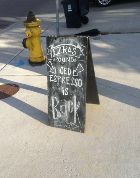
This chalkboard sign for Ezra’s Pound in Liberty Village is super-enthusiastic, regardless of its temporary nature. It incorporates not one but three arrows and the word “Back” is full of flair.
This sign really, really, really wants to get you excited about iced espresso and I admire its conviction.

Chalkboard signs have a quirky, offhand way of commanding attention. I think part of the reason they can be riveting is that it’s rare to get a handwritten note these days. Coming across a chalkboard sign is like receiving a lovingly crafted message from a close friend.
Shopgirls is a Parkdale clothing boutique that amps up the appeal of chalkboard signs by creating a whole assemblage of them. I get the feeling they would have kept right on going, but the structure likely wouldn’t support much more.
This sign goes out of its way to be affectionate and if I were a woman, who knows, I just might obey its command immediately.
Enjoyed this post? Browse Arrows

This Parkdale diner’s sign has a lot going for it: neon, primary colours, an evocative name, contrast between casual script and bold caps…
And that arrow: it gives you a friendly nudge if you’re feeling hungry and not sure where to eat.
If it’s ancient (and it likely is), it’s no doubt been refurbished. It has a teenager’s zip and the vintage style of someone who’s been around for decades.
In short, this sign captivates me. I want to buy it a burger and a Coke and listen to its stories.
Enjoyed this post? Browse Script

Here’s a revised sign that caught my eye recently. You’ll notice that “99¢” has been obliterated, but is still faintly visible beneath white paint that doesn’t match the wall colour.
The original bargain may have been worth trumpeting at billboard scale… but stripped of its price, “hot dogs” now seems absurdly grandiose. That becomes the sign’s charm—a bold announcement of something unremarkable.
That and of course the long, long arrow (hot dog inspired?) that turns at the very last second.

This sign warns of an unpredictable gate that is “able to be moved without prior warning.” If you don’t pay enough attention, it might actually kill you.
The pictogram manages to be grisly and funny at the same time. I don’t get it though: if the arrow represents the force of the gate, what’s that black bar that the figure is being squashed against?
Fortunately, I managed to take this picture and lived to tell the tale.

I suspect that the blocked words are “please use other sidewalk,” but then again I don’t know for sure. I’d have to tear off the duct tape to find out.
This sign makes me think of hostages with their mouths taped shut. Even if the suppressed words are banal, there’s a menacing mood here.
But I guess there’s another way to see it: the double lines of tape are actually blanks, waiting for someone to fill them in with alternate instructions.
What would you write?

Looks like Jim reduced the hours of his business. Given the condition of his sign it seems he’s been running this place for a while, so he deserves to cut back a little, don’t you think?
The result of the revision almost looks like “Open 2 Hours.” I suppose by leaving a fraction of “24” visible he’s saying he’s now open part of the day, rather than the entire day.

I spotted this sign while in Montreal recently. I guess it’s temporarily off-duty, or at least being a bit laissez-faire in directing traffic.
Ever get the feeling that signs get sick of telling us where to go and what to do all the time?
This sign must have needed a break on a hot summer day and I admire its nonchalance.

I’m drawn to this sign’s weather-beaten appearance, but it’s the arching triangles of “Oriental Cuisine” that keep me looking and thinking. Would an Asian restaurant use this style of lettering in the present?
I’m also intrigued by the red arrows: one word on each of them, and they point in different directions.
The signboard with “David’s” painted on it looks like it could be a later addition. Is there another name underneath?
