
Sangria and gelato become all the more tantalizing when advertised by a sign as stylish as this one.

Sangria and gelato become all the more tantalizing when advertised by a sign as stylish as this one.
Happy Victoria Day everyone!
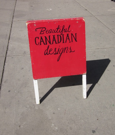
Here’s a sign that shows how simple it can be to make a huge impact. Two colours. Three words. Hand painted lettering. That’s all it takes to make a lot out of a little.
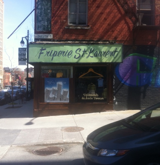
I was in Montreal back in May and I snapped this photo of one of my favourite Montreal signs. Its style is laid back yet elegant, like the dashed off handwriting on a greeting card to a friend.
This is a vintage clothing shop and the sign is absolutely fitting. It has the verve of an outfit that transforms its wearer into an effortlessly chic urbanite. Buy an item of clothing here and who knows whom you’ll become!

This sign bets it all on going bold… and succeeds.
If the poodle silhouette were simplified it would become a pictogram, but as it stands it has too much detail to be one.
There’s a pleasing contrast here between refined script and forceful image. Overall this is a very effective sign.

Happy Holidays from Toronto Type!
(With some festive typography courtesy of William Ashley China! Thank you for spreading holiday cheer on Bloor Street!)

This Parkdale diner’s sign has a lot going for it: neon, primary colours, an evocative name, contrast between casual script and bold caps…
And that arrow: it gives you a friendly nudge if you’re feeling hungry and not sure where to eat.
If it’s ancient (and it likely is), it’s no doubt been refurbished. It has a teenager’s zip and the vintage style of someone who’s been around for decades.
In short, this sign captivates me. I want to buy it a burger and a Coke and listen to its stories.
Enjoyed this post? Browse Script

If someone wrote this to you, how would you take the words in parentheses? The handwriting here looks playful, lighthearted. The crosses on the t‘s look like smiles. Let’s hope that a little bit was just a prelude to a lot.
I took this photo quite some time ago. I was in the neighbourhood a few days ago and noticed the wall is painted completely white. So this photo is now a time capsule.
Speaking of love, the most viewed post on Toronto Type is True Love Café. Have you ever been?
Happy Valentine’s Day everyone!

This is a close up shot of a window display at a jewellery and gift shop called Labour of Love. I was captivated by the cascade of envelopes and packages, a blizzard arrested in mid-flight.
Why are hand-addressed envelopes and packages so compelling? Is it now largely due to their increasing rarity in a digital age? It’s interesting that icons of envelopes are inescapable online, even as paper envelopes become relics.
This display is a smart marketing move. Not only is it attention-grabbing, it puts you in the right mood for giving thoughtful gifts. The shop also carries a lot of unusual greeting cards.
It’s the season to escape the keyboard occasionally and pick up a pen!

This gigantic calligraphic question might sound a bit arrogant, but the fact that “writing” is misspelled makes it funny as well.
This is part of the cluster of handmade signs that I spotted in Montreal. (Please see my previous post.) The small sign here, “for the love of letters”, suggests the artist’s motivation for creating these one-of-a-kind messages.
And yet they’re abandoned on the street. Gifts to strangers maybe? I wouldn’t be surprised if someone walked off with a sign or two after I took the photos.

I was in Montreal recently and came across this sign while strolling on Avenue Mont-Royal. It was part of a whole jumble of signs at the edge of the sidewalk, and of course I had to stop and take pictures.
It looked as if an aspiring calligrapher was getting ready to move and was getting rid of his experiments. After a day of exposure to commercial signs and street signs, encountering a sign that’s so personal is a little disarming.
Who is the one who’s waiting? Who is “you”? It’s up to us to invent the story.
