Archive for the ‘Script’ Category

Please ensure that…

September 16, 2010

Please ensure that

This sign has a split personality: one part polite and one part hostile. I love the contrast between the delicate script and the big red caps.

Wouldn’t it be fun to leave the door ajar, just to see what would happen? What do you think the creator of this sign is like in person?

Advertisement

David’s Restaurant

August 11, 2010

David's Restaurant

I’m drawn to this sign’s weather-beaten appearance, but it’s the arching triangles of “Oriental Cuisine” that keep me looking and thinking. Would an Asian restaurant use this style of lettering in the present?

I’m also intrigued by the red arrows: one word on each of them, and they point in different directions.

The signboard with “David’s” painted on it looks like it could be a later addition. Is there another name underneath?

Delicious

July 19, 2010

Delicious

What I love about this wall is that you can see at least two different ads dissolving into one another. That word on the left looks like “PRINCE” and it gently competes with the Coca-Cola logo. I’m reminded of what it sounds like when the radio is tuned between two stations, that hazy, unrepeatable music.

Wouldn’t it be lovely to see this wall as a time-lapse film, a rapid dissolve from bare brick wall to ad to ad… through all the stages of visual ruin to its current state?

Mom

May 9, 2010

Mom

This papered-over storefront must have been a clothing boutique at one point. The remaining word and image look like excerpts from a greeting card whose sentiments are appropriate for today.

Happy Mother’s Day!

The Manhattan

April 7, 2010

The Manhattan

Toronto is famous for disguising itself as other cities in the movies. This longing to be transformed into someplace else is apparent even in the names of many buildings.

Here’s an apartment building that proudly announces itself as “The Manhattan.” The upward tilting script suggests a dramatic optimism. This sign has the wishful energy of a magic spell.

What would a building called “The Toronto” be like?

Coral Sea Fish Market

March 2, 2010

Coral Sea Fish Market

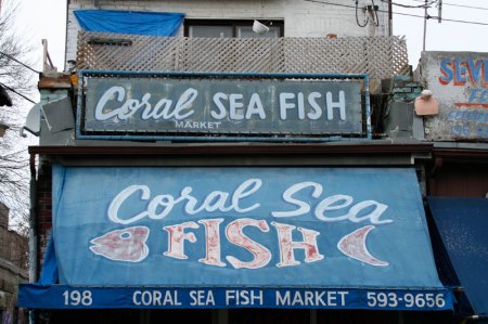
I like all the shades of blue here and especially the weathered surface of the upper sign. If you study it closely, you’ll notice there’s another word faintly visible underneath: it seems to be “PEOPLE’S.”

Take a look at the word “FISH” on the awning. It’s so eager to convey fishiness that it bends itself into the shape of the creature it signifies. How irresistible is that?

Also, in a city where the main body of water is Lake Ontario, there is something very appealing about the words “Coral Sea,” don’t you think?

Company Promotion

February 5, 2010

Company Promotion

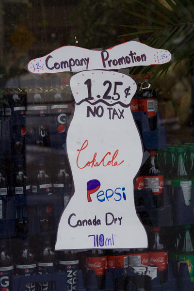
I get the feeling the store owner is personally excited about this deal, don’t you?

The shape of the sign mimics the curviness of a classic Coke bottle. There’s an attempt to imitate the iconic Coca-Cola ribbon, rendered here as “CokaCola.” The Pepsi logo becomes two wavy areas of colour inside the letter P. Canada Dry doesn’t receive quite as much love.

I suppose this is an example of the power of branding. Even if you mangle a successful visual identity, it still retains some of the force of the original.

it’s good to see you

November 11, 2009

it's good to see you

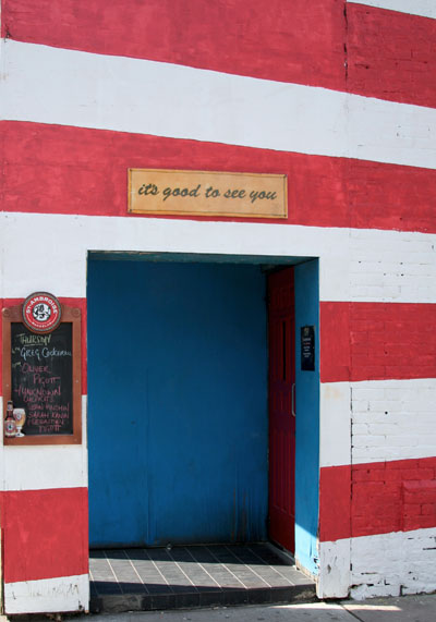
You’ll find this sign above the entrance to a bar and its implication is provocative: perhaps not only can we recognize buildings, but buildings can also recognize us.

The lowercase script has the intimacy of a friendly scrawl on the back of a postcard. To walk beneath this sign is to accept an embrace.

When you enter your local watering hole, isn’t this the message you secretly crave? (As opposed to “back so soon?” or “not you again!”)

Imagine if all buildings were this welcoming!