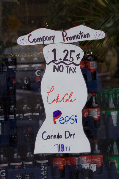
I get the feeling the store owner is personally excited about this deal, don’t you?
The shape of the sign mimics the curviness of a classic Coke bottle. There’s an attempt to imitate the iconic Coca-Cola ribbon, rendered here as “CokaCola.” The Pepsi logo becomes two wavy areas of colour inside the letter P. Canada Dry doesn’t receive quite as much love.
I suppose this is an example of the power of branding. Even if you mangle a successful visual identity, it still retains some of the force of the original.

Leave a comment