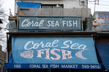
I like all the shades of blue here and especially the weathered surface of the upper sign. If you study it closely, you’ll notice there’s another word faintly visible underneath: it seems to be “PEOPLE’S.”
Take a look at the word “FISH” on the awning. It’s so eager to convey fishiness that it bends itself into the shape of the creature it signifies. How irresistible is that?
Also, in a city where the main body of water is Lake Ontario, there is something very appealing about the words “Coral Sea,” don’t you think?

Leave a comment