Archive for the ‘Damage’ Category

Adore Pedestrians

March 7, 2012

Adore Pedestrians

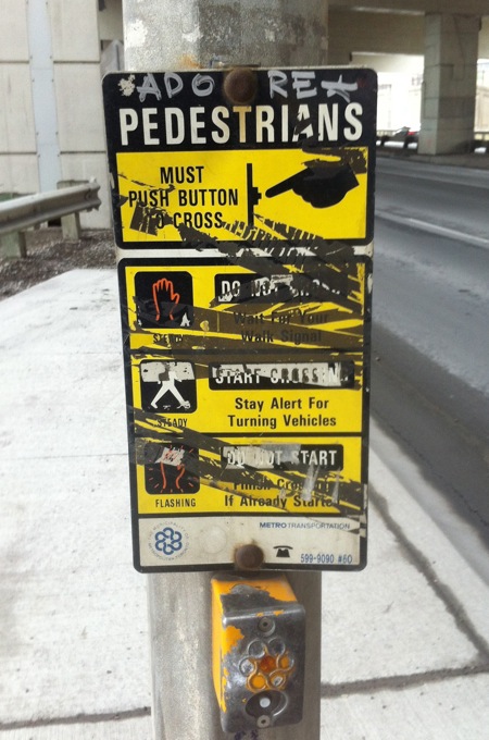
I love instructions for simple activities like crossing the street. They convey an image of the world as a helpful place. They say: no matter how small your concern, there’s guidance if you look for it.

The signs at Toronto crosswalks are often hard to read, unfortunately. They’re frequently encrusted with grime or barnacled with stickers or messed up in one way or another.

In this case, there’s a positive message that shines through, a command to “adore pedestrians”. And what pedestrian doesn’t need a little love while walking beneath the Gardiner Expressway?
The Book Mark

February 28, 2012

The Book Mark

Even though it feels a bit ghoulish to study a vacant storefront, in this case I can’t help myself. The remnants of this bookshop have a kind of poetry.

Faint traces of the sign’s black letter type are evident and the scattered spots are probably patched-up holes where the letters were once attached to the wall. There are notices on the windows, including “We will miss you all.”

This was once the home of The Book Mark, an independent bookseller that closed its doors for good in January after being in business for over four decades.

The barely-there sign is now an epitaph of sorts and it won’t be visible for much longer.

where are the animals?

November 23, 2011

where are the animals?

Here’s an enigmatic postscript beneath a rusty old No Parking sign. The stencilled red words demand attention and the upside down question mark adds intrigue. The message seems to be crying tears of blood.

Is this the lament of a former country dweller, who is missing the presence of wildlife? Is it the cry of an animal rights activist, enraged by murderous vehicles? What do you think?

McCann’s

August 4, 2011

McCann's

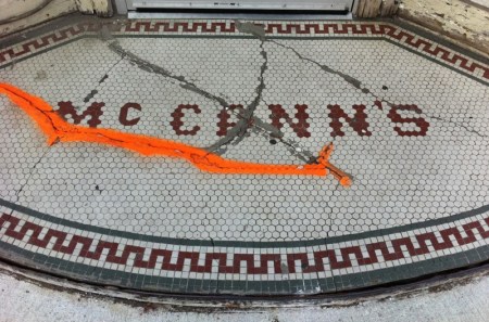
It looks like this sign was patched up in the past, but the concrete has chipped away, leaving the cracks exposed. Is that fluorescent mark a placeholder for the next repair?

The lettering, composed of hexagonal tiles, is bumpy-edged yet completely legible. It’s somehow dignified and goofy all at once.

This sign is like a weathered face with a mysterious scar. You want it to speak and tell you its story.

Look Happy

February 21, 2011

Look Happy

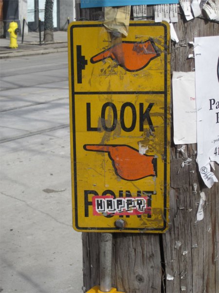
I noticed this sign on my lunch break last week and returned the following day to snap a picture. Looking happy is a challenge in the middle of a Toronto February… but on a long weekend it’s a little bit easier.

Imagine a city with street signs for moods and mental states, traffic lights for our daily interactions. Would we live together more harmoniously?

Now that retailers have whisked away their Valentine’s Day gift items, it’s good to think about how we truly feel about one another. And on that note, I’ll share a revealing fact with you: the most viewed post on Toronto Type is this one.

Syd Silver

January 30, 2011

Syd Silver

I used to walk past this sign and hope that it would be restored someday. All the rust and burnt out bulbs couldn’t detract from its aura of glamour and aspiration.

I took this picture back in the fall. If I recall correctly, the shop was already vacant at that point. Since then the sign has been removed and 500 Yonge is now behind scaffolding.

Perhaps Toronto needs a sign museum to commemorate influential businesses that disappear. Think of all the weddings and proms and parties that could be conjured up by the sight of this sign. Here’s to you, Syd Silver, for presiding over Yonge Street for decades and for all the moments you made more magical.

Coffee Shop

October 28, 2010

Coffee Shop

This sign doesn’t just have the look of coffee, it has the flavour of it too. Stare at it for a few moments and you’ll taste something dark, earthy and intoxicating. I love the idea that a sign can excite more than your optic nerve – it can also awaken your tongue.

Anyone recognize this sign? In which coffee shop will you find it?

City Wide

October 21, 2010

City Wide

When I started this project I didn’t expect I’d become a connoisseur of dumpsters, but there’s something about their scarred exteriors and utilitarian labels that I find compelling.

Here I like the way the letters are spaced out across compartments and the words are staggered instead of aligned. Even thought these letters are damaged, they announce themselves with the charisma of celebrities… and I’m defenseless, ready to gawk and ask for autographs.

Jim’s Restaurant

September 1, 2010

Jim's Restaurant

Looks like Jim reduced the hours of his business. Given the condition of his sign it seems he’s been running this place for a while, so he deserves to cut back a little, don’t you think?

The result of the revision almost looks like “Open 2 Hours.” I suppose by leaving a fraction of “24” visible he’s saying he’s now open part of the day, rather than the entire day.


David’s Restaurant

August 11, 2010

David's Restaurant

I’m drawn to this sign’s weather-beaten appearance, but it’s the arching triangles of “Oriental Cuisine” that keep me looking and thinking. Would an Asian restaurant use this style of lettering in the present?

I’m also intrigued by the red arrows: one word on each of them, and they point in different directions.

The signboard with “David’s” painted on it looks like it could be a later addition. Is there another name underneath?