Archive for the ‘Damage’ Category

Delicious

July 19, 2010

Delicious

What I love about this wall is that you can see at least two different ads dissolving into one another. That word on the left looks like “PRINCE” and it gently competes with the Coca-Cola logo. I’m reminded of what it sounds like when the radio is tuned between two stations, that hazy, unrepeatable music.

Wouldn’t it be lovely to see this wall as a time-lapse film, a rapid dissolve from bare brick wall to ad to ad… through all the stages of visual ruin to its current state?

Advertisement

Danger Work Overhead

May 14, 2010

Danger Work Overhead

A danger sign that’s battered and scarred like this one has credibility. It says: watch out, or this might end up happening to you.

There’s something weirdly imprecise about most danger signs, isn’t there? They tell you you’re at risk, but they don’t tell you what exactly to do about it.

Levack Block

May 3, 2010

Levack Block

I like the way these letters are the same colour as their backdrop. They don’t clamour for attention, they just rely on their three-dimensionality to be noticed.

The “L” is missing and its absent form is clearly visible. I wonder if the letter is sitting there on that ledge or if pigeons have carried it off.

The letter “K” appears twice and I admit I like the first version best. Check out the shape: it has the playful stance of a cartoon character.

Body Gear

April 18, 2010

Body Gear

This sign is just down the street from Metro Central YMCA. The shop it advertises is long gone; I believe it sold sports supplements. Now the panels are gradually decaying and one is completely missing.

The sign is also next door to the Coroner’s Court building, where mysterious deaths are investigated. In a way, this street is all about bodies, living and deceased, and the ravaged letters of Body Gear speak unexpectedly of the joys and vulnerabilities of being in the flesh.


True Love Café

February 16, 2010

True Love Cafe

On Valentine’s Day I made a special pilgrimage to True Love Café and snapped some pictures. It’s located in Toronto’s most violent neighbourhood, right at the intersection of Dundas and Sherbourne. The facade is plastered with hearts, but these are neglected hearts, bruised hearts, hearts that have seen better days.

It’s disconcerting to see a dilapidated monument to love in a part of town known for robberies and vicious assaults. When I visited on Monday, the café was dark inside. I don’t know if it’s a currently functioning business.

Hope Valentine’s Day left your heart in better condition than what we encounter at this sad street corner.

Scientific Skin Care Center

February 8, 2010

Scientific Skin Care Center

I often pass this sign while riding the streetcar and it transfixes me every time. Is it her shellshocked expression that gets me? Perhaps it’s the contradiction between the idea of skin care and a sign that looks ravaged by the elements.

I’m also struck by the unusual choice of flowing script for the word “Scientific.” You would expect something more antiseptic. Against a faded backdrop, the word registers as nothing but a whisper.

Still, it’s her face that keeps me looking. This nameless woman, champion of Science, has become a landmark in my city travels. I’d be lost without her.

Portugal Auto Garage

January 18, 2010

Portugal Auto Garage

What I like best about this sign is the little painting of the sports car nestled  under the arch of “Auto Garage.” The tomato red line is a bit wobbly and hesitant, as if made by someone more comfortable holding a wrench than a paintbrush.

The damaged black letters appeal to me as well. All those scratches give the business name a look that’s rough, ready and real. I’m reminded of the distressed type you often see in action flick posters.

And how about that repainted phone number? On another sign it might seem klutzy, but here? Just perfect.

Open

December 18, 2009

Open

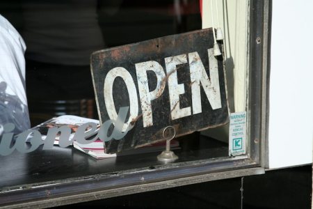
“It’s a binary world,” my Dad used to say. Then, as evidence, he’d list off a bunch of opposing pairs, like on or off. Of course it would annoy me, since my own impulse was to look for a spectrum of possibilities.

But some things really are binary, like this sign: Open or Closed. Flip it around and it changes from one state to the other. If everything in life were this clear, we’d be in good shape.

This sign has been through a lot and has the battle scars to prove it! (So has my father.)

Castrol

November 25, 2009

Castrol

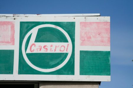
I enjoy looking at signs that show the effects of weather and time. Here I’m guessing that several layers of paint have washed away, leaving the first methodical brushstrokes. The result has the appearance of Pop art: think of the flags and targets of Jasper Johns.

It’s satisfying to imagine that signs that look polished and invincible might harbour something human and vulnerable underneath.

I Miss You

November 22, 2009

I Miss You

Five things I love about this sign:

1.  It blows up a private sentiment to billboard scale.

2.  It invites you to imagine stories about “you” and “I.”

3.  Its zigzagging ribbons have the kinetic elegance of a spiderweb.

4.  It’s soul-baring yet anonymous.

5.  It’s gradually unravelling, like a less and less potent emotion.

If it’s still there in the winter, I’ll photograph it again.