Archive for the ‘Revisions’ Category

Look Happy

February 21, 2011

Look Happy

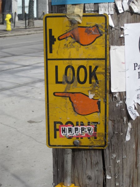
I noticed this sign on my lunch break last week and returned the following day to snap a picture. Looking happy is a challenge in the middle of a Toronto February… but on a long weekend it’s a little bit easier.

Imagine a city with street signs for moods and mental states, traffic lights for our daily interactions. Would we live together more harmoniously?

Now that retailers have whisked away their Valentine’s Day gift items, it’s good to think about how we truly feel about one another. And on that note, I’ll share a revealing fact with you: the most viewed post on Toronto Type is this one.
Advertisement

No Pie

January 17, 2011

No Pie

I spotted this sign on a TTC platform this weekend. A few strokes of a magic marker and a cigarette was transformed: “No Pie” became TTC by-law number one.

I wonder if the clever person who amended this was feeling oppressed by negative New Year’s resolutions? Doesn’t “No Pie” capture that January feeling perfectly?

I say we lift the ban: more pie for everyone! Let’s eat it boldly and defiantly! Let’s devour it on TTC platforms all over the city!

Traffic Calmed Neighbourhood

November 28, 2010

Traffic Calmed Neighbourhood

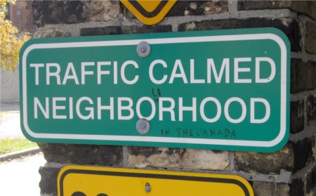
The traffic may be calmed, but I get the feeling that the person who corrected this sign was agitated. Very agitated.

It takes a certain level of irritation to pull out a magic marker and correct a misspelling. Most of us would idly note the error and move on. Or more likely, not notice it at all.

Was this person traumatized at an early age by overly competitive spelling bees? Or is this simply a patriotic Canadian who insists on defending our spellings, no matter what the occasion?

Jim’s Restaurant

September 1, 2010

Jim's Restaurant

Looks like Jim reduced the hours of his business. Given the condition of his sign it seems he’s been running this place for a while, so he deserves to cut back a little, don’t you think?

The result of the revision almost looks like “Open 2 Hours.” I suppose by leaving a fraction of “24” visible he’s saying he’s now open part of the day, rather than the entire day.


David’s Restaurant

August 11, 2010

David's Restaurant

I’m drawn to this sign’s weather-beaten appearance, but it’s the arching triangles of “Oriental Cuisine” that keep me looking and thinking. Would an Asian restaurant use this style of lettering in the present?

I’m also intrigued by the red arrows: one word on each of them, and they point in different directions.

The signboard with “David’s” painted on it looks like it could be a later addition. Is there another name underneath?

Woodgreen … Church

June 28, 2010

Woodgreen ... Church

Apparently this used to be a United Church and now it’s Anglican. They didn’t do such a good job of concealing the transition. That substance on the sign looks like chewing gum.

I wonder if there’s a meaning in this gesture: an animosity towards another Protestant denomination perhaps, or a holier-than-thou attitude. Or is it just evidence of a relaxed attitude towards signmaking?

Green

June 21, 2010

Green

When I see the word “green,” it usually means someone wants to sell me something. That’s why I like this sign so much: nothing’s for sale. And it’s a defunct gas station, so the word is perfectly apt.

The typeface looks like Cooper Black, which I find to be unabashedly sincere, both ugly and lovable at the same time.

Addison

May 19, 2010

Addison

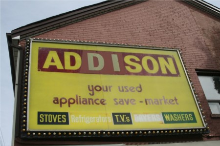
I like signs that have been visibly amended. Here a “D” and “I” are obviously a later addition, and the awkward spacing suggests that the store name was different before. Does anyone recall what the original name was?

Since I took this picture, someone added a new layer to the sign: the store is now officially called “Gold’s.” I have a hunch that this isn’t the end… there are probably new layers to come.

Anger Not Enter

April 28, 2010

Anger Not Enter

This is the first photo I’m posting that comes from a contributor and he happens to be my Dad. He discovered this sign on the south end of the St. Andrew subway platform and snapped a few pictures.

At one point the sign must have said “Danger Do Not Enter.” It seems that someone replaced a tile but used a blank one as the substitute, leaving a curiously altered message.

It made my father think of the biblical directive not to let the sun go down on your anger. I see an inadvertent comment on the fiery emotions of TTC riders. What do you see?

Coral Sea Fish Market

March 2, 2010

Coral Sea Fish Market

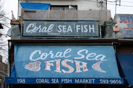
I like all the shades of blue here and especially the weathered surface of the upper sign. If you study it closely, you’ll notice there’s another word faintly visible underneath: it seems to be “PEOPLE’S.”

Take a look at the word “FISH” on the awning. It’s so eager to convey fishiness that it bends itself into the shape of the creature it signifies. How irresistible is that?

Also, in a city where the main body of water is Lake Ontario, there is something very appealing about the words “Coral Sea,” don’t you think?