McCann’s

August 4, 2011

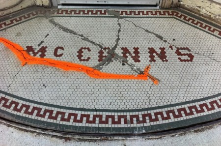
McCann's

It looks like this sign was patched up in the past, but the concrete has chipped away, leaving the cracks exposed. Is that fluorescent mark a placeholder for the next repair?

The lettering, composed of hexagonal tiles, is bumpy-edged yet completely legible. It’s somehow dignified and goofy all at once.

This sign is like a weathered face with a mysterious scar. You want it to speak and tell you its story.
Pedestrian X

July 29, 2011

Pedestrian X

I noticed this sign in Leslieville recently. Should we be on the lookout for creatures like this in the neighbourhood? Has anyone sighted one crossing the street?

Maybe this is what pedestrians look like to some motorists: sluggish, prehistoric beasts. Traffic-stopping monsters.

Seen through a car windshield, someone practicing the ancient art of walking might seem like a strange animal indeed.

No Parking

July 13, 2011

No Parking

This is just a small excerpt from a huge mural in Kensington Market. What’s usually a stark prohibition is transformed into a B-movie extravaganza.

It makes all the other signs a driver faces in this city seem bereft of imagination, a wasteland of humdrum commands.

What if every sign in Toronto had this degree of graphic whimsy? Would we be more likely to obey instructions? Or would we be so busy grinning that we’d forget to take the orders seriously?

Hot Dogs

June 28, 2011

Hot Dogs

Here’s a revised sign that caught my eye recently. You’ll notice that “99¢” has been obliterated, but is still faintly visible beneath white paint that doesn’t match the wall colour.

The original bargain may have been worth trumpeting at billboard scale… but stripped of its price, “hot dogs” now seems absurdly grandiose. That becomes the sign’s charm—a bold announcement of something unremarkable.

That and of course the long, long arrow (hot dog inspired?) that turns at the very last second.

WhY?

June 16, 2011

Why?

This sign takes the most primal question – why? – and pairs it with a drawing of a fallen ice cream cone. It evokes childhood loss – those small tragedies that at the time leave you heartbroken. The chalkboard only reinforces the sense of early lessons learned.

It may seem strange to advertise ice cream with an image of disappointment. But perhaps we’re also meant to recall the adult who stepped in and bought the replacement ice cream cone… and being the adult now, we’ll walk into the shop to regain that feeling of comfort and security.

Go-Go Gas Bar

June 7, 2011

Go-Go Gas Bar

This is one of those signs that can get caught in your brain like a pop song. Maybe it’s the contrast between the manic energy of “Go-Go” and the angular seriousness of “Gas Bar.” Or is it the network of cracks, adding an anxious undertone to the sign’s graphic punch?

This sign reminds me of the curious images in David Lynch movies: it offers an innocuous first impression, combined with something foreboding.

Toronto Hydro Electric System

May 31, 2011

Toronto Hydro Electric System

It’s easy to miss this sign on an overcast day: the letters blend into their stone backdrop. But on a sunny day the sign comes alive, the cast shadows elongating and tilting with the time of day. It’s an unexpected sundial.

I love the way the oxidation stains on the wall interact with the shapes of the shadows, creating an almost phosphorescent effect. And also the way you can ignore the metal letters completely and just read the temporary design they’ve made. Beautiful.

Caution Icicles Falling

May 23, 2011

Caution Icicles Falling

I snapped this photo in the financial district just last week, tangible evidence of our late spring.

Collapsed and laying flat on the sidewalk, the sign looks defeated. By now it’s probably packed away in a storeroom, where it will rest for the next few months.

Happy Victoria Day!

Toronto Disposal Ltd.

May 16, 2011

Toronto Disposal Ltd.

My dumpster fixation continues. Trust me, I’m strictly interested in their outsides, not their insides.

Here it’s the name that grabs me: Toronto Disposal Ltd. It implies that they’re tossing our city itself into the garbage. And in a way, they’re correct. Brick by brick and block by block our city is being dismantled and replaced with something glossier.

The next time you pass a dumpster, show some respect, because it might be part of your neighbourhood in there.

Crema

May 6, 2011

Crema

Usually I photograph outdoor signs, but here’s an indoor one that caught my eye. You may have noticed I have a strange affection for signs with mismatched letters, and this one is particularly endearing. Even though it’s composed of an assortment of typefaces it has an orderliness to it.

Or maybe not. That orange “M” is a bit of an attention hog. I get the sense that the “C’ is secretly annoyed by its ostentatiousness but is pretending not to care, attempting a stoic indifference. It has its place at the front of the word, so why worry?