Archive for the ‘Numbers’ Category

Victory Cleaners

November 6, 2010

Victory Cleaners

It’s the big red “1” in this sign that commands attention, so prominent that it splits the name of the business in two. Even though it literally refers to one hour service. it has a “we’re number one” grandeur that feels victorious.

The number’s on my mind right now because exactly one year ago today I posted the first photo on Toronto Type. Thank you fellow sign lovers and type fanatics for coming along on this visual adventure! Thank you for adding your comments and for joining the movement to look at our city in a more attentive way.

This is just the beginning, so please keep returning to see what’s new. And don’t be shy: I welcome your responses to what I’m posting and I’d also love to hear about any interesting signs you’ve discovered around the city. It’s easy to get in touch.

Happy Birthday Toronto Type!

Advertisement

Jim’s Restaurant

September 1, 2010

Jim's Restaurant

Looks like Jim reduced the hours of his business. Given the condition of his sign it seems he’s been running this place for a while, so he deserves to cut back a little, don’t you think?

The result of the revision almost looks like “Open 2 Hours.” I suppose by leaving a fraction of “24” visible he’s saying he’s now open part of the day, rather than the entire day.


5

March 17, 2010

5

The pure physicality of signs can be their most impressive trait. During a day of looking at words and images on screens, it’s often a relief to be confronted with a message that doesn’t scroll, that isn’t clickable, that’s so clearly made up of inflexible matter.

Here you see a doorpost at the entrance to a Spanish restaurant. Stucco, wood, metal, paint, screws: the construction is simple yet forceful and the saturated primary colours create a ferocious intensity.

The irony of my project? Sure, I’m escaping the world of pixels in my city walks, but at the same time I’m also returning, by translating my observations into… pixels!

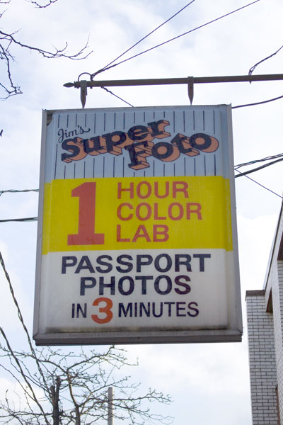
Jim’s Super Foto

February 19, 2010

Jim's Super FotoWhy do deliberately misspelled words seem so exciting? If this sign read “Jim’s Super Photo” it wouldn’t be half as interesting.

I like the way there are three blocks of information here, each with its own background colour. That huge number one really grabs attention and the smaller number three pops out from its white and navy setting.

Jim obviously respects his potential customers: he makes his sign easy and fun to read and he promises to deliver his services in strict time frames. Who can argue with that?

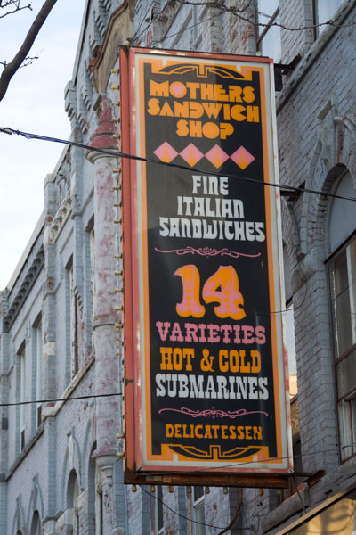
Mothers Sandwich Shop

January 28, 2010

Mothers Sandwich Shop

This sign has the exuberance of a circus poster. It takes a daring designer to put pink, orange and white type on a black background. My guess is that this display of style dates from the seventies.

It’s layered like a sandwich and there’s so much going on that it asks for more attention than we usually give these days. Are we willing to look up from a mobile screen long enough to see this?

It doesn’t matter: the sandwich shop is long gone. The current business below is a clothing boutique. The sign continues to announce “14 Varieties” that we can only dream of tasting.


675

November 29, 2009

675

The New York Times recently ran a funny article about errors in typography and the intense pain they can trigger in people who adore type.

I completely understand the sensation of horror that a gaffe can arouse. But at the same time, in wandering the city and observing signs, I find it’s often the glitches and mistakes and points of failure that make something memorable.

For example, take this number I often pass by on Yonge Street. That painted seven bracketed by three-dimensional siblings is irresistible. I suppose the original fell off and needed to be replaced. I can just picture the resourceful signmaker who came up with this solution, thinking maybe nobody will notice the difference.

What about you? Do flaws in typography irritate you or delight you?