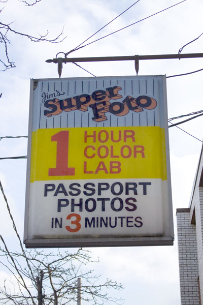
 Why do deliberately misspelled words seem so exciting? If this sign read “Jim’s Super Photo” it wouldn’t be half as interesting.
I like the way there are three blocks of information here, each with its own background colour. That huge number one really grabs attention and the smaller number three pops out from its white and navy setting.
Jim obviously respects his potential customers: he makes his sign easy and fun to read and he promises to deliver his services in strict time frames. Who can argue with that?
Leave a comment