TTC BY-LAW NO. 1

May 2, 2012

TTC BY-LAW NO. 1

I appreciate smoke-free environments, but the sight of prohibitions everywhere gets me down. The signs are usually so stern and humourless that it’s no wonder people try to lighten the mood with a little whimsy.

Last year I featured a no smoking sign that someone had transformed into a ban on pie. Here’s one that someone has turned into an edict against trains.

Given that the TTC openly admits to the possibility of electrocuting you, I wonder what punishment they’ve cooked up for renegade smokers.

Or for that matter, for people who alter their signs.

Bond Saloon

April 26, 2012

Bond Saloon

One of the pleasures of looking at Toronto signs is that there are so many in more than one language to discover. Here’s one in English and Tamil for a hair salon.

Saloon, rather. The business name has a tough-guy ring that also conjures up Agent 007.

I imagine it’s the proprietor in the painting and I wonder if he painted the portrait himself.  On Flickr there’s a photo of the same sign taken a few years ago, and the shirt is a different colour. I guess the sign is repainted now and then.

Wouldn’t it be something if his hairstyle got updated every so often? Or if he gradually looked more mature with each repainting?

Furniture Emporium

April 19, 2012

Furniture Emporium

I noticed this truck while sitting in a cafe and dashed outside to take pictures. The design is so exuberant and over-the-top that I almost want to order furniture from this store, just so the truck will show up.

I like the way the business name doesn’t take centre stage but leaves most of the space to those wild, gyrating forms. The contrast is powerful: well-behaved lettering in black, white and grey next to colour-saturated mayhem.

Furniture Emporium Detail

Those letters stand at the edge of a crowded dance floor and may be on the verge of joining in.

Furniture Emporium Detail

What do you imagine this store’s furniture looks like?

Glyphs

April 12, 2012

Glyphs

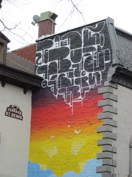
This is the upper part of a mural I spotted on Rue St. Denis while in Montreal recently. A cloud of glyphs pulsates with life.

There’s a playful Pac-Man-like quality to the forms and not all of them seem to be letters. Some are more like strange creatures.

The design teases us with the possibility of meaning, but I doubt it’s intended to make much sense. Can you discover a message here?

PBS Arts Presents Type

April 5, 2012

This wonderful short video features a number of designers talking about the power of typography. It appeared last August as part of Off Book, a web series from PBS. It’s packed full of smart observations and at the end there’s a quick tutorial on talking about type.

One of my favourite remarks is from Deroy Peraza who says “fonts are clothes in a sense. They help visually externalize your identity to the world.” That comment helps me understand why I’m fascinated by type as I walk around the city. In a way, it’s akin to people-watching, a way of studying how identity and meaning become visible.

Were there any moments that stood out for you?

By the way, thanks to my brother Greg for alerting me to the video when it first came out.

Corm-A-Rama

March 28, 2012

Corm-a-rama

I noticed this poster in the window of Type Books recently, the shop I wrote about in January because of its sensational viral video. The multi-coloured mismatched type is attention-grabbing and the flags promising music and merriment add to the festive tone.

The poster trumpets an event to raise money for writer Derek McCormack, who will be undergoing treatment for cancer. There will also be a fundraising art sale beginning April 1 at 12:00 noon ET, which you can learn about at artforderek.com.

It’s great to feel a blast of graphic energy with such good intentions behind it. By the way, the poster is available as a printable pdf.

Press Grey…

March 21, 2012

Press Grey

Recently a friend and I took advantage of the warm weather and headed out to Toronto Island for the day. I was startled by this handmade sign above the ticket machine at the ferry docks.

I guess the machine is so bewildering to some that it requires this extra explanation. There’s an eight-step process and a whole lot of parentheses.

We’d already purchased our tickets at the ticket booth, so there was no need to interact with the machine. Has anyone used the device and been successful?

Adore

March 13, 2012

Adore

This word fits neatly into the stair-like shape of the facade. I appreciate the command because it’s so open-ended: Adore what? Adore whom? We’re left to fill in the blank ourselves.

On a spring-like day in Toronto it’s easy to find something to adore. The sensation of a warm breeze on my face. The feeling of the ground beneath my feet.

What are you adoring now?

The ascending letter here also make me think of “Do-Re-Mi.” Soon I’ll be having visions of Maria Von Trapp in Trinity Bellwoods Park.

Adore Pedestrians

March 7, 2012

Adore Pedestrians

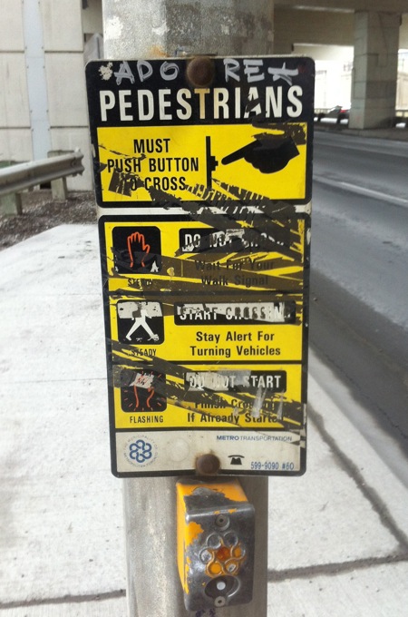
I love instructions for simple activities like crossing the street. They convey an image of the world as a helpful place. They say: no matter how small your concern, there’s guidance if you look for it.

The signs at Toronto crosswalks are often hard to read, unfortunately. They’re frequently encrusted with grime or barnacled with stickers or messed up in one way or another.

In this case, there’s a positive message that shines through, a command to “adore pedestrians”. And what pedestrian doesn’t need a little love while walking beneath the Gardiner Expressway?

The Book Mark

February 28, 2012

The Book Mark

Even though it feels a bit ghoulish to study a vacant storefront, in this case I can’t help myself. The remnants of this bookshop have a kind of poetry.

Faint traces of the sign’s black letter type are evident and the scattered spots are probably patched-up holes where the letters were once attached to the wall. There are notices on the windows, including “We will miss you all.”

This was once the home of The Book Mark, an independent bookseller that closed its doors for good in January after being in business for over four decades.

The barely-there sign is now an epitaph of sorts and it won’t be visible for much longer.