
Happy Holidays from Toronto Type!
(With some festive typography courtesy of William Ashley China! Thank you for spreading holiday cheer on Bloor Street!)
Happy Holidays from Toronto Type!
(With some festive typography courtesy of William Ashley China! Thank you for spreading holiday cheer on Bloor Street!)

Here’s a sign with a sense of economy, making the most of just six letters and a punctuation mark.
The rough-hewn look—what seems to be spray paint on plywood—is in keeping the world of vinyl records and analogue recordings.
I am so curious whether or not the store owner’s initials are really L.P. If so, how perfect.
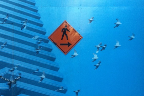
One of the things I like about this pictogram sign is its artful placement on a hoarding at a condo site. A walking figure joins a flock of birds.
How would you interpret the juxtaposition? As a call to be closer to nature? As an encouragement to be free as a bird? The combined pictogram-photo awaits your exegesis.

I love this sign for its sense of mischief. It’s suggestive without crossing the line into vulgarity.
The playful store name becomes a kind of makeshift clothing for the two models. The product—socks—takes centre stage, while it’s left unclear whether these two are wearing anything else.
What do you think? Is this sign going too far to attract attention?


I’ve noticed that my last five posts are about food and drink related signs. Maybe there’s some connection between hunger/thirst and intriguing typography.
Here’s another one to add to the list. The full sign reads North of Brooklyn Pizzeria and its location in the middle of a wall is unusual and eye-catching.
The restaurant and its sign are on a side street, but they’re visible from the intersection. Perhaps the sign’s placement is intended to tempt people into making an unplanned detour.
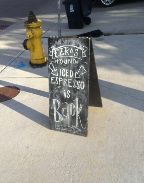
To make a chalkboard sign is to embrace impermanence. No matter how stylish or ornate the lettering is, it’s designed to be eventually erased.
What’s more, an outdoor chalkboard sign is vulnerable to bad weather. One sudden rainstorm and it’s wiped out.
This chalkboard sign for Ezra’s Pound in Liberty Village is super-enthusiastic, regardless of its temporary nature. It incorporates not one but three arrows and the word “Back” is full of flair.
This sign really, really, really wants to get you excited about iced espresso and I admire its conviction.

Ice cream trucks are often a source of typographic delight. Painted letters capture the pleasure of cool treats on hot days.
Here’s an excerpt from one that sports bold grafitti. The wild lettering promises enjoyment that is within reach, just moments away.

One of my favourite signs in the city is a Toronto Hydro Electric System sign whose appearance changes with the position of the sun. The cast shadows of the letters add interest to what is otherwise a simple and straightforward sign.
This sign for Nadège, a pastry shop next to Trinity Bellwoods Park, operates in a similar fashion. The letters and the row of shapes beneath look spare and elegant; they’re enlivened by the shifting design they make on the wall supporting them.

There are two kinds of signs in a city, those that are static and those that move. In the latter category, signs on delivery trucks can be particularly striking.
Here’s one celebrating a beer called Cracked Canoe. While the name suggests vulnerability, the typeface looks sturdy and invincible. This contradiction makes for an intriguing sign.

Some words cry out to be a particular colour. Carmen is a word that virtually demands to be red.
This West Queen West restaurant sign is proof that you don’t have to go big to make a huge impact. It’s limited in size and has the oomph of a firecracker.
