Archive for the ‘Uncategorized’ Category

Smile

January 19, 2014

Smile

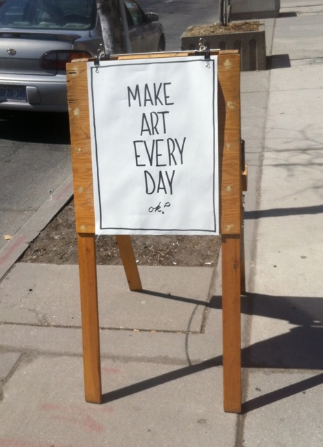
I took this photo back in the fall and it seems appropriate for the beginning of a new year.

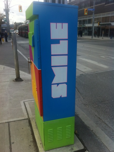
In the past I’ve speculated about the idea of traffic signs for human emotions. Here’s a good example of what it could look like.

Happy New Year, dear readers! May 2014 give you many reasons to smile.

Advertisement

floorplaysocks

September 15, 2013

floorplaysocks

I love this sign for its sense of mischief. It’s suggestive without crossing the line into vulgarity.

The playful store name becomes a kind of makeshift clothing for the two models. The product—socks—takes centre stage, while it’s left unclear whether these two are wearing anything else.

What do you think? Is this sign going too far to attract attention?

floorplaysocks

Pizzeria

August 17, 2013

Pizzeria

I’ve noticed that my last five posts are about food and drink related signs. Maybe there’s some connection between hunger/thirst and intriguing typography.

Here’s another one to add to the list. The full sign reads North of Brooklyn Pizzeria and its location in the middle of a wall is unusual and eye-catching.

The restaurant and its sign are on a side street, but they’re visible from the intersection. Perhaps the sign’s placement is intended to tempt people into making an unplanned detour.

Ice Cream

June 30, 2013

Ice Cream

Ice cream trucks are often a source of typographic delight. Painted letters capture the pleasure of cool treats on hot days.

Here’s an excerpt from one that sports bold grafitti. The wild lettering promises enjoyment that is within reach, just moments away.

Nadège

June 6, 2013

Nadège

One of my favourite signs in the city is a Toronto Hydro Electric System sign whose appearance changes with the position of the sun. The cast shadows of the letters add interest to what is otherwise a simple and straightforward sign.

This sign for Nadège, a pastry shop next to Trinity Bellwoods Park, operates in a similar fashion. The letters and the row of shapes beneath look spare and elegant; they’re enlivened by the shifting design they make on the wall supporting them.

Cracked Canoe

May 21, 2013

Cracked Canoe

There are two kinds of signs in a city, those that are static and those that move. In the latter category, signs on delivery trucks can be particularly striking.

Here’s one celebrating a beer called Cracked Canoe. While the name suggests vulnerability, the typeface looks sturdy and invincible. This contradiction makes for an intriguing sign.

Carmen

April 28, 2013

Carmen

Some words cry out to be a particular colour. Carmen is a word that virtually demands to be red.

This West Queen West restaurant sign is proof that you don’t have to go big to make a huge impact. It’s limited in size and has the oomph of a firecracker.

Make Art…

April 14, 2013

Make Art

Here’s a sign that makes a grand call to action. I like the way “Make Art Every Day” is followed by a little “ok?”. It’s asking you to agree to something rather ambitious.

I encountered this in front of an art supply store in The Junction. The store stands to gain if pedestrians go along with the command. The sign is mounted on an easel, reminding viewers of the paraphernalia of art making.

What do you think? Are you ready to answer this sign with a triumphant “Okay!”

Cho’s Discount Hardware

March 23, 2013

Cho's Discount Hardware

This sign looks a bit dilapidated, but that’s somehow appropriate. Wouldn’t it be strange for a discount store to have a flashy, expensive-looking sign?

Chunky, three-dimensional letters make up the word “hardware” and small, pointing hands act as bullets calling attention to the store’s offerings. Bilingualism widens the sign’s audience.

Did you notice the spelling error? It doesn’t bother me. It gives the sign an authenticity that slicker signs would have a hard time matching.

Caution…

March 7, 2013

Caution

I’m a big fan of caution, danger and warning signs. Humdrum city walks become risky adventures, with fresh threats at every turn.

This caution sign is persistent. It’s in place 365 days of the year, including the hottest days of summer. Then it’s potentially invigorating to imagine snow falling from the roof.

Don’t you think this sign would benefit from an added pictogram? It would make the hazardous, snow-releasing roof all the more thrilling.