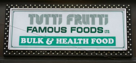
The typeface used for “Tutti Frutti” is like a racetrack for the eyes. It sends your gaze reeling around curves and jumping from letter to letter. I particularly like the first “U” and the way it connects one “T” with the next.
(Make sure you click on the image to see a larger version. You’ll better see the parallel lines that make up each letter.)
This sign has a showbizzy magnetism. It announces “Famous Foods” and the dense border of lightbulbs creates a carnival feeling. Step right up!
Yes, the use of green is predictable for a food shop. But take another look at the words “Tutti Frutti” and tell me you expected that.

Leave a comment